Case study: Walkapp
CASE STUDY
Product strategy, UI design and digital systems from concept to prototype
Overview
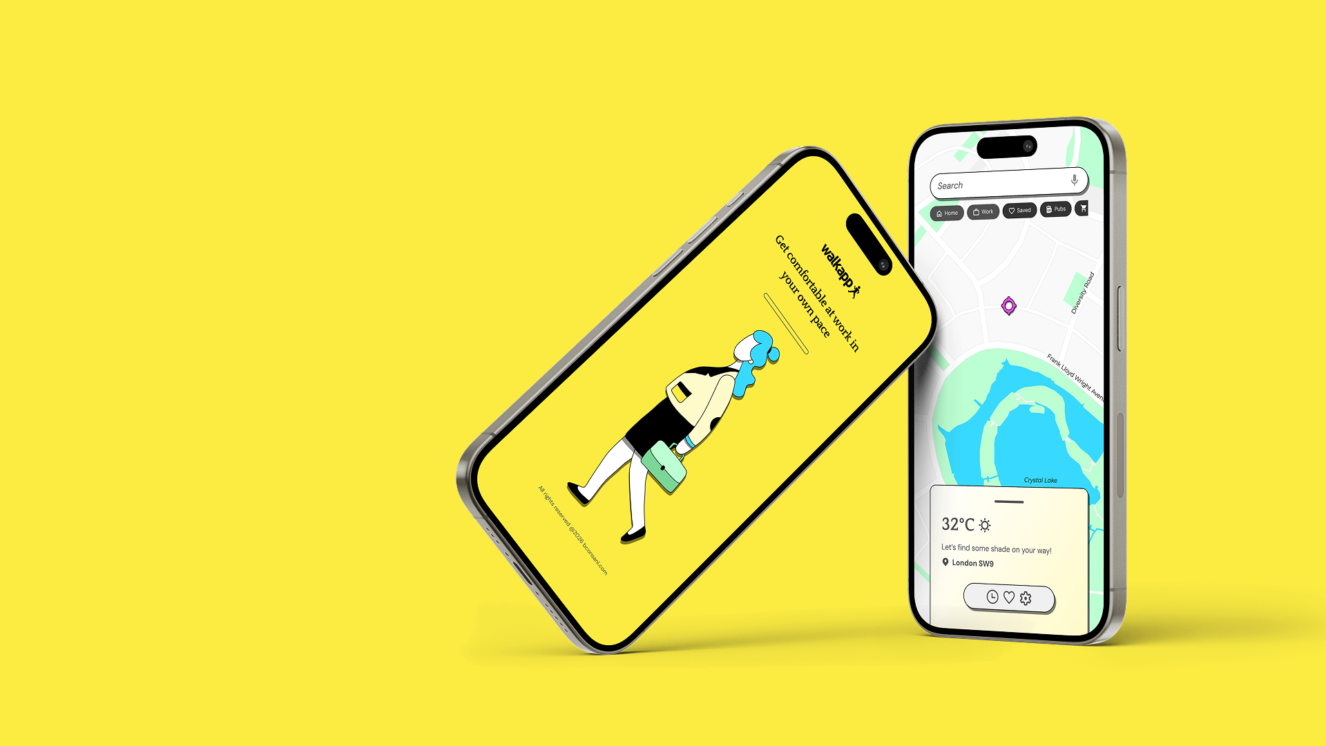
A start-up product designed to improve everyday walking by allowing users to choose routes based on sunlight and shade. From identifying the opportunity to defining the product strategy, brand identity, UX, interface and design system, every stage of the project was conceived and executed by myself with support of AI tools for research, not design. The result is a complete end-to-end product case that combines problem solving, branding and digital product design.
Unlike traditional navigation apps that optimise for speed, Walkapp explores comfort as a new dimension of route planning.
The challenge
The climate in the world is changing and people deserve comfort. Most navigation apps optimise for speed, but ignore one of the biggest factors affecting pedestrian comfort: environmental conditions. During hot weather, the shortest route is rarely the most pleasant one.
The challenge was to rethink navigation around user comfort while keeping the experience intuitive, scalable and technically believable. Considering design principles like familiar interaction patterns, minimal cognitive load and inclusive outdoor experience. The project is currently in the prototyping stage.

🧰 Role: Product Designer operating as partner and decision maker on strategy and identity.
I led the project end-to-end from initial opportunity identification through product strategy, branding, UX research, interface design, prototyping and design system documentation.
Product Strategy
UX Research
User Flows
Information Architecture
Brand Identity
UX/UI Design
Design System
Interactive Prototype
What I’ve delivered
Product Strategy: Problem definition + Value proposition + Feature prioritisation
UX Research: User journey + Pain points + Personas + User scenarios
Interface Design: Wireframes + High-fidelity UI + Component library + Responsive behaviour
Design System: Tokens, Components, Accessibility and Documentation
Tool kit for this project:


• Product Journey
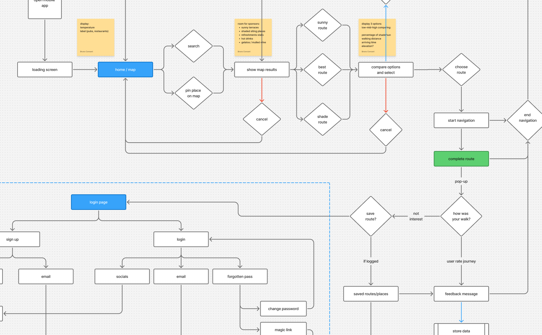
Discovery: User flow mapping the complete journey from app launch to destination completion. A few features are still WIP, such as the login flow and settings journey. Can’t display full details.
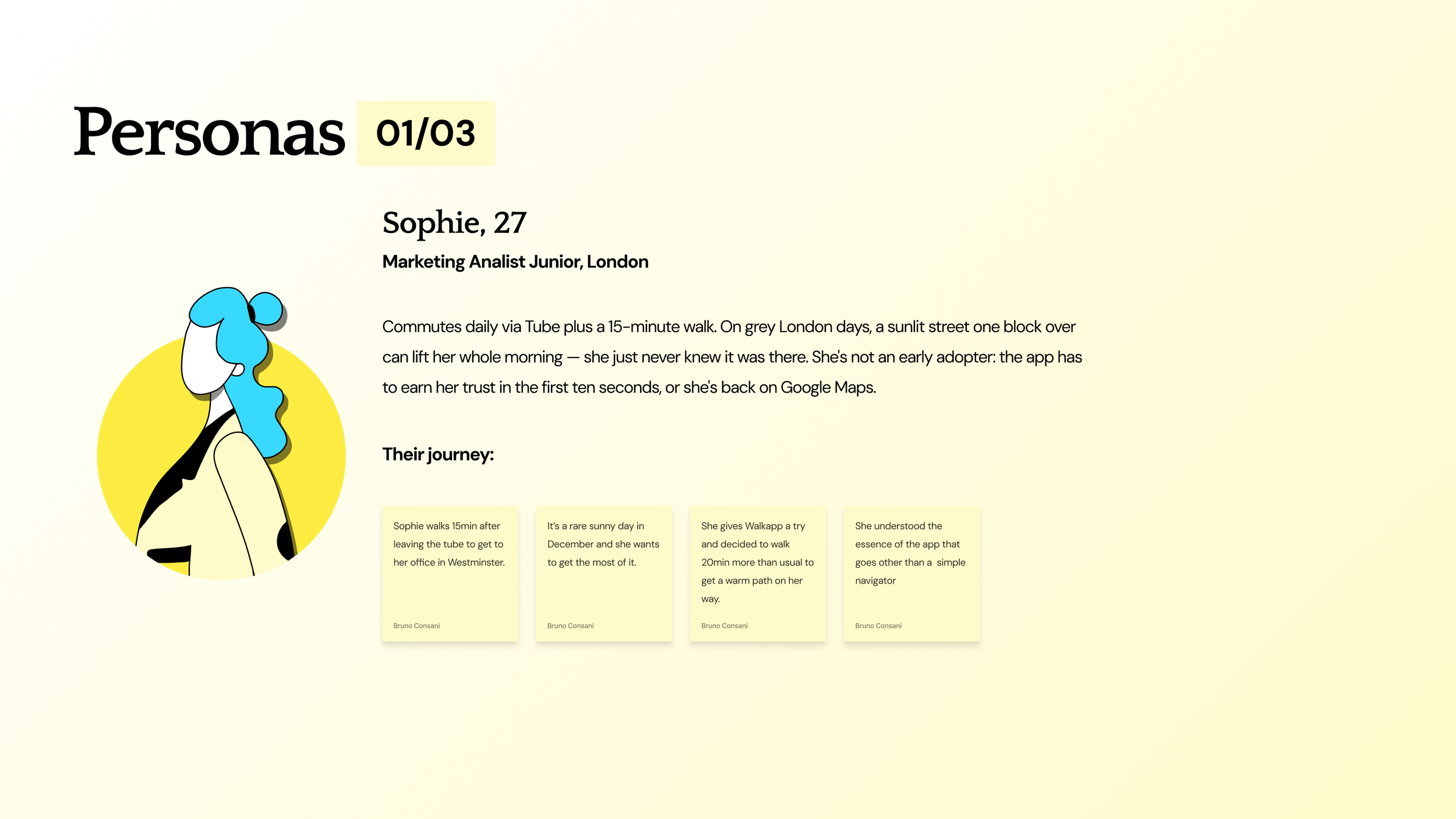
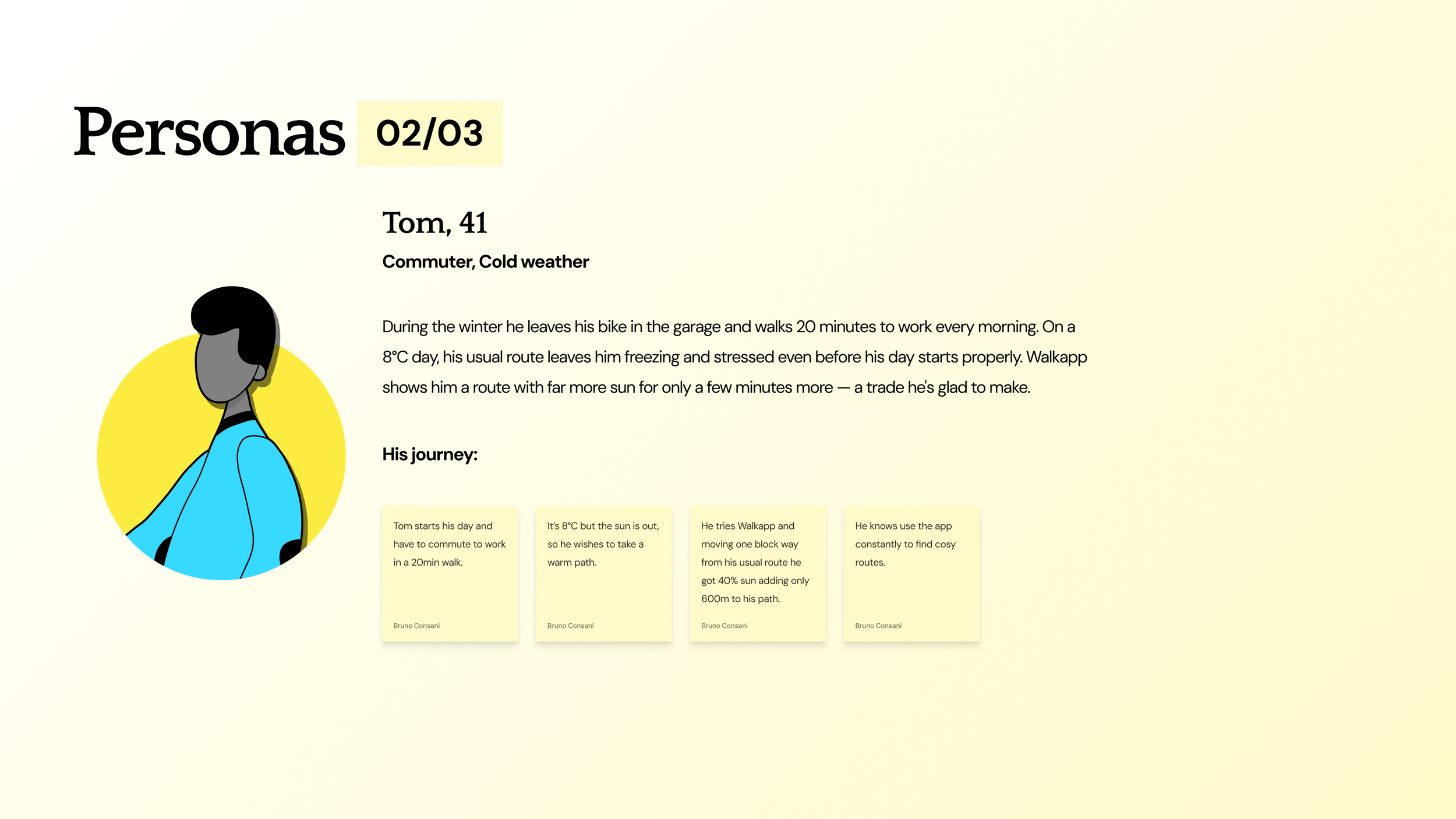
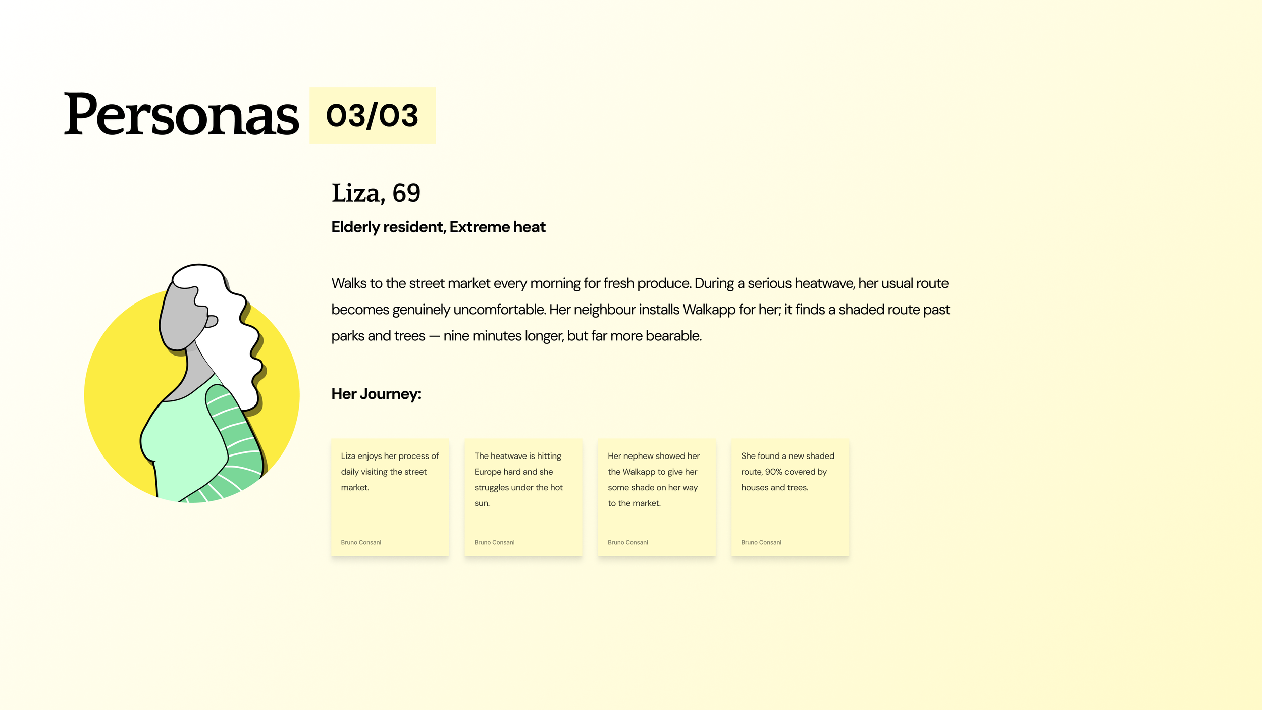
Research: Three people, three climates, one toggle. Walkapp works in both directions, chasing sunlight when it is rare and finding shade when it becomes uncomfortable.
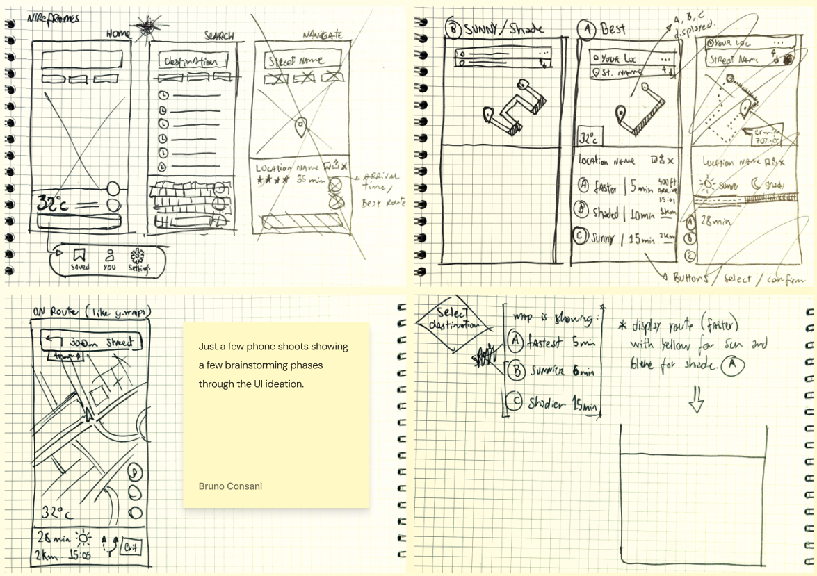
Wireframes: The creative process started with sketches and low-fidelity wireframes to validate visual hierarchy and core functionality before moving into high-fidelity UI.
• Design System
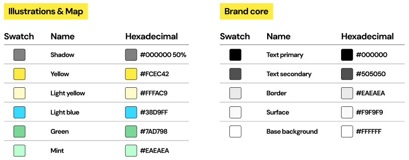
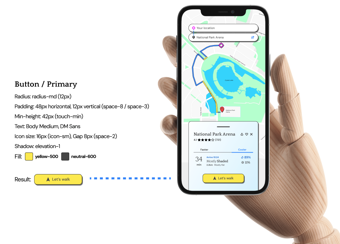
A concise, purposeful system. Every element, icon, font and color has a purpose. Sun routes are always brand yellow. Shade routes are always dark blue. The locator and navigation arrow are a distinct purple so they're never confused with the route itself. This is how we’ll guide you.
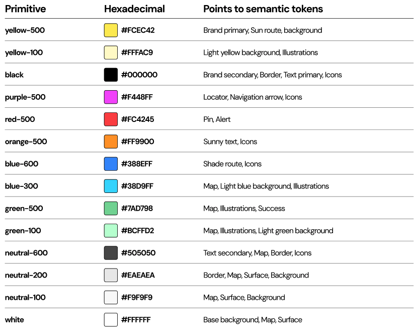
Colours: The raw scale underneath every semantic color. Neutral naming with no assigned meaning at this stage, semantic tokens on the following pages each point back to one of these.
Wayfinding: The colors with functional meaning on the map itself. Rule to state on the page: yellow always means sun, dark blue always means shade — this logic never changes across the app
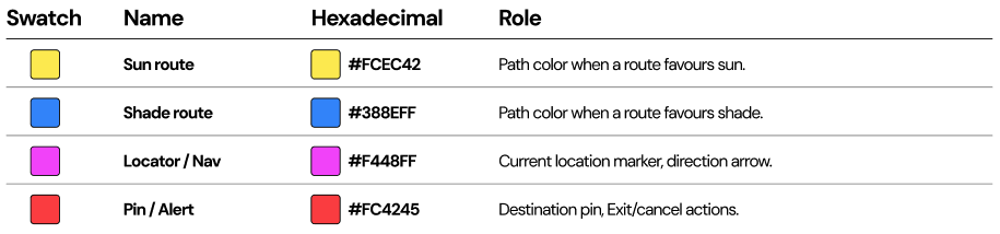
Illustration & Map tints: Text, surfaces, structure palette. Softer tints used in illustrations and map fills — not used as UI accents.
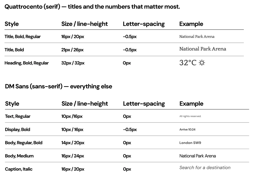
Typography: Two typefaces, clear division of labour.
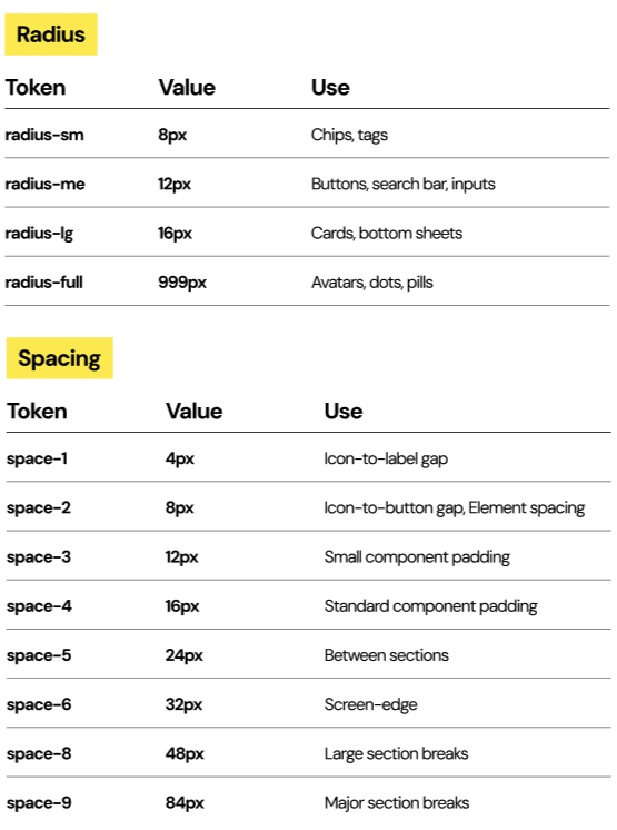
Radius & Spacing: The base units every component is built from. Spacing (base 4px): 4 · 8 · 12 · 16 · 24 · 32 · 48 px
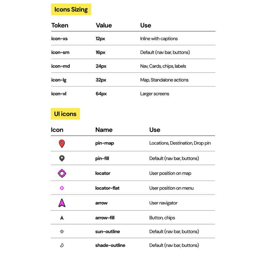
Icons: Icon sizing to provide better UX experience and hierarchy during the navigation. Design is brand-aligned and scalable for new features.
Applied example: Showing the system working together on one real component.
Visuals are structure for the product, scalable for other medias and ready for brand development. Typography representing a path terrain followed by the walking person icon walking comfortably. Brand will keep developing as product and marketing needs.
• Visual identity / Brand
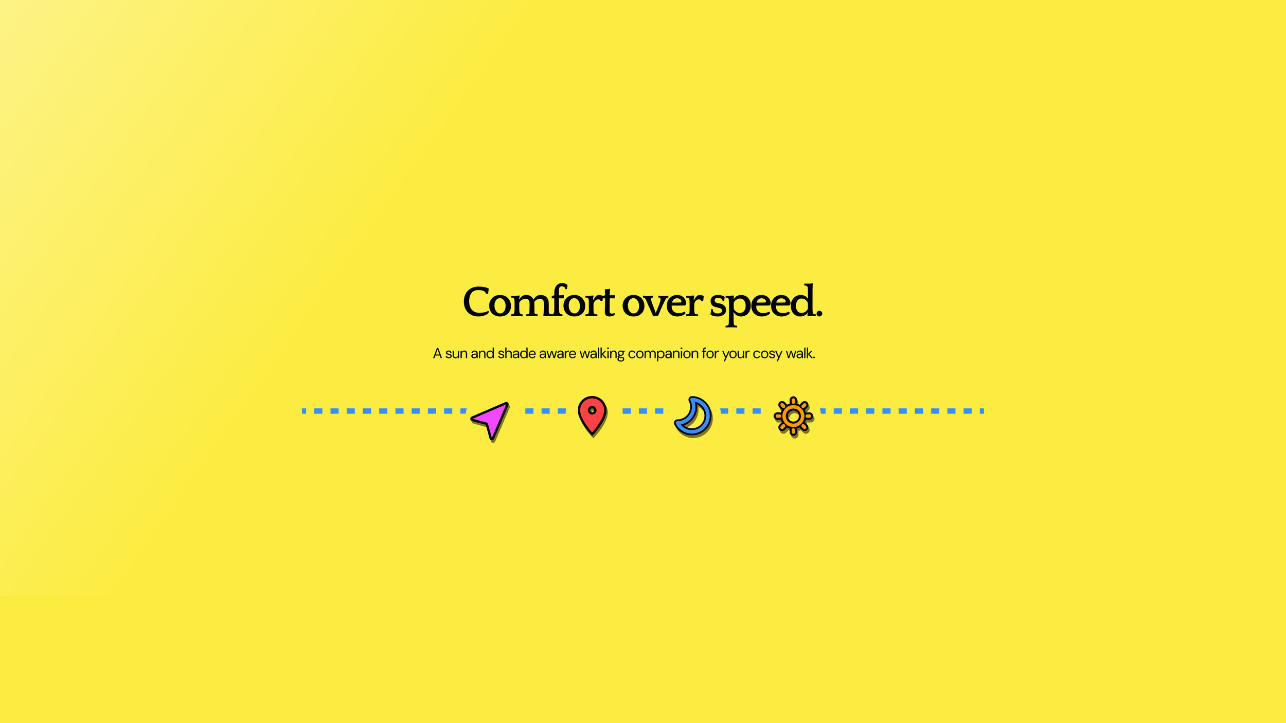
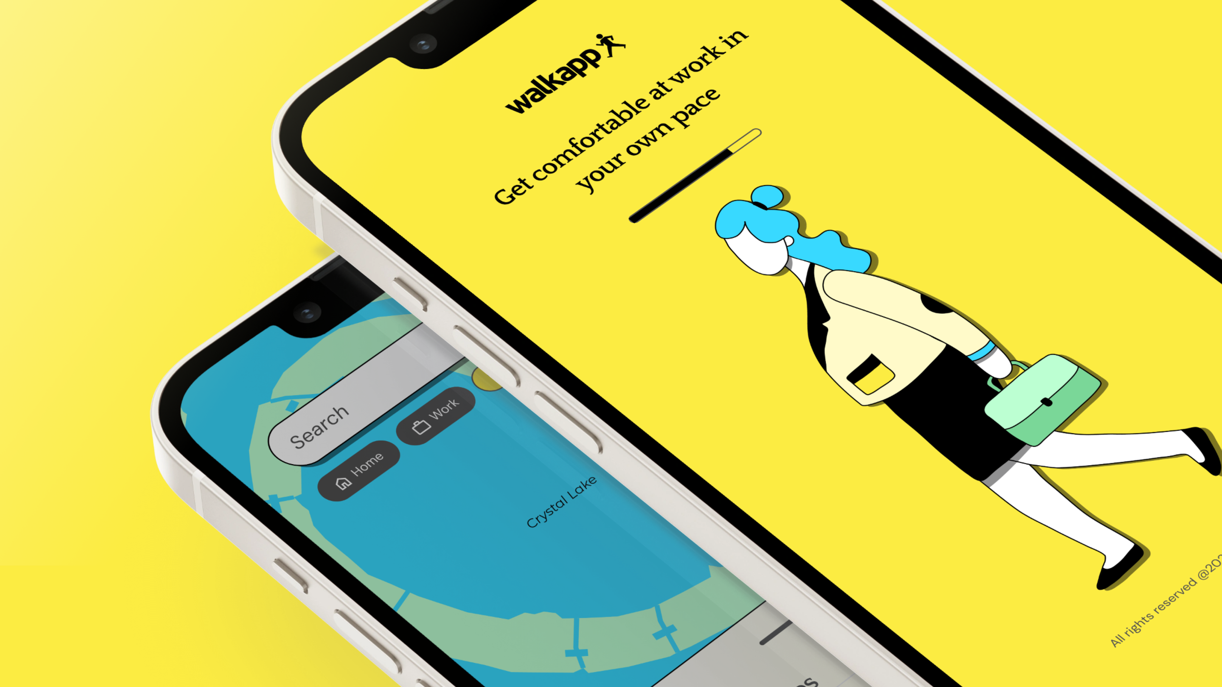
Visual approach: The way to communicate with my designs was to keep it in simple and comfort colours, like vibrand pastel tones (it that can be possible). This reminds the user traffic instructions and navigation mindset but flirting with gamification and cosy UI. This opens a huge door for product development in the future which is in progress but private at the moment.
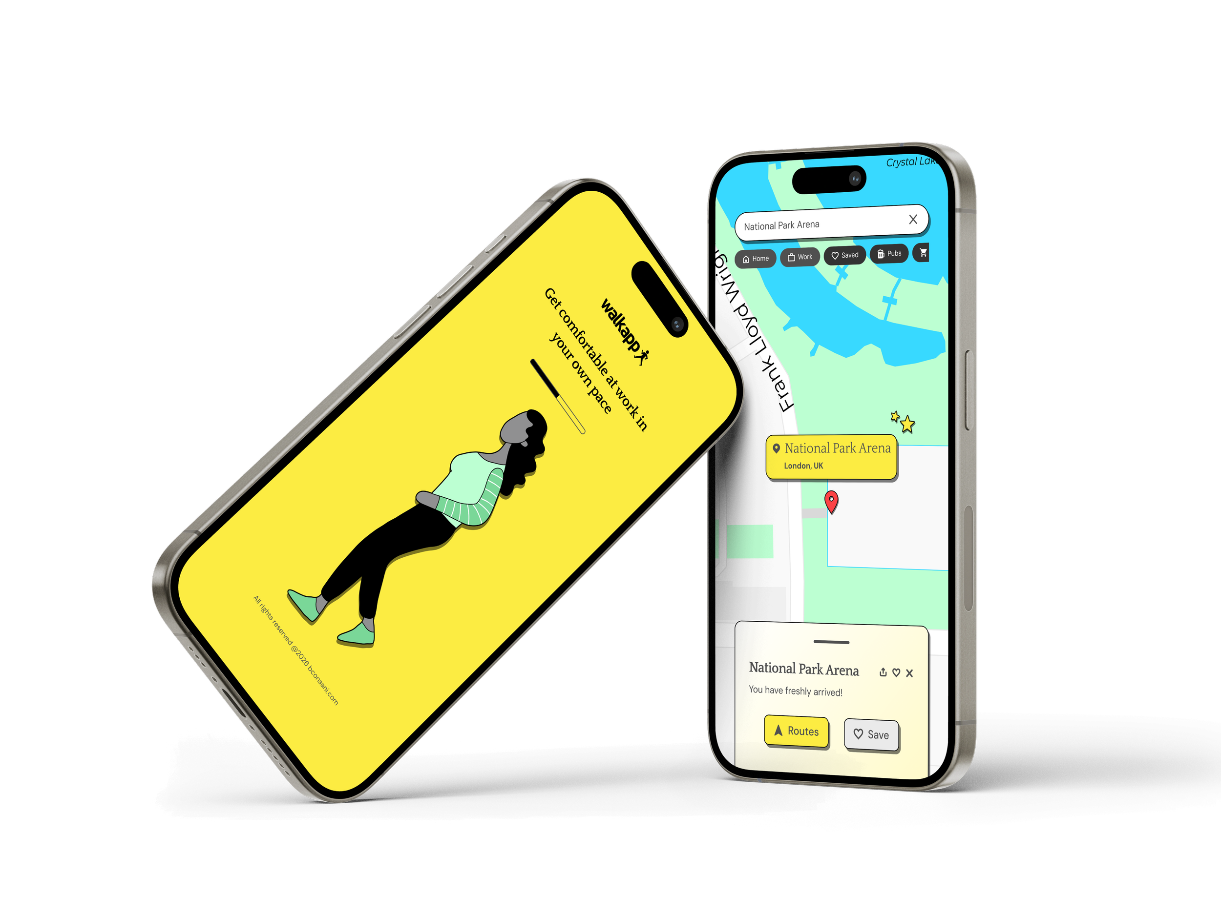
Typography and colours were proposed to avoid stressing-eyes from user and thinking about scalate the app aiming for more interaction. Many accessibility touch points like contrast, sizing and spacing were applied to this round while there’s more to come as the app grows.
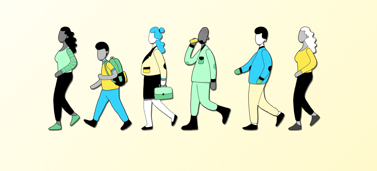
Illustrations: Illustrations support the branding and positions the app in a comfort-category. That also helps scalability for product gamification and marketing proposes.
• Product experience
The product aims to deliver the user journey quickly and cosy.
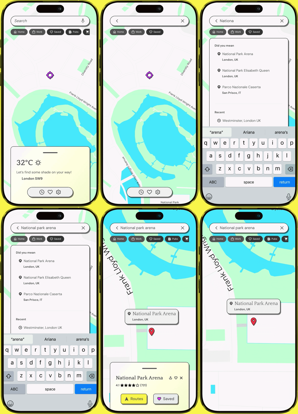
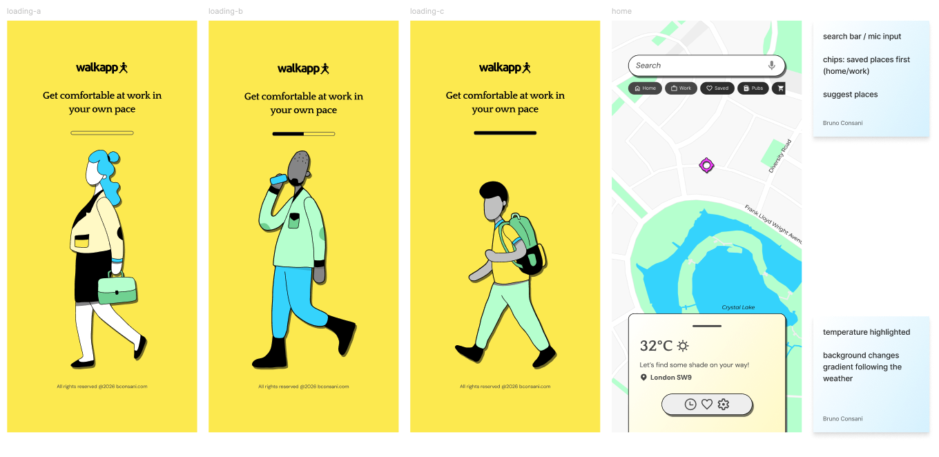
New users see the map, the weather, and a plain-language nudge ("Let's find some shade on your way!") before anything else (during hot days, the opposite happens in colder days). There's no account wall and no explanation needed, the value is visible immediately.
Onboarding and home screen: the weather widget doubles as a trust signal and a contextual nudge to encourage user to act.
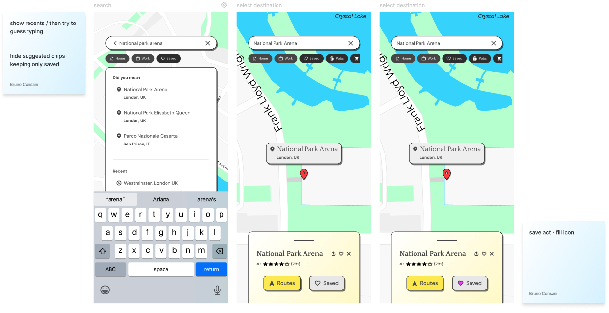
Search and results: like on most common maps, user search for addresses or places, and the results will be based on location and real-time spelling generating results, less effort for the user.
Navigation and map: Once a destination is set, Walkapp shows two routes side by side: the fastest and the most comfortable. Each is scored with a simple, concrete stat showing a percentage sun exposure, distance, and elevation. Navigation screen under tests to improve hierarchy and display more information.
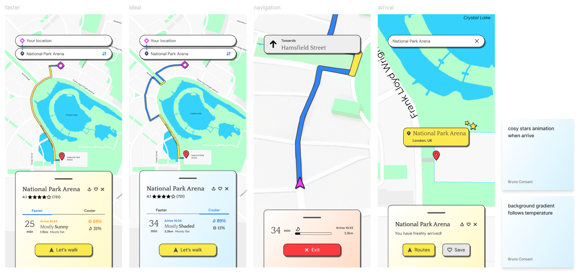
End journey and saved places: During navigation, the interface simplifies to the essentials: direction, time, and an exit option. At this stage, the goal is for the walker to pocket their phone and just walk. Arrival is deliberately like a quiet confirmation, not a celebration. In the next steps, the product can slowly start introducing interactions flirting with gamification and expand partnerships.
Frequent destinations and favourite places are saved locally, so repeat journeys get faster over time without ever requiring sign-up. User should see this app as a friend not an attention-grabber. Settings screen is in progress, prototype stage.
Next steps: While focusing on helping users discover comfortable walking routes, the platform could evolve into a broader urban wellbeing ecosystem through personalisation, community features and predictive recommendations.
Outcome
Walkapp demonstrates the complete lifecycle of a digital product—from identifying an everyday problem to delivering a fully branded product supported by UX research, interface design, prototyping and a scalable design system. The project reflects my approach to combining strategic thinking with hands-on execution across both brand and product design.
📈 Skills demonstrated
End-to-end Product Design
Product Strategy
UX Thinking
Design Systems
Branding
UI Design
Prototyping
Visual Design
Product Storytelling
MORE CASES
Brand systems, identity and campaign work