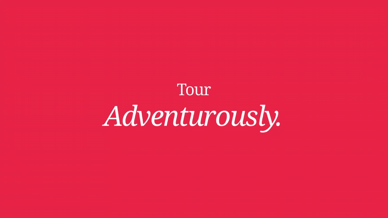
Case study: Hypefill
CASE STUDY
Brand identity & design system for a next-generation fulfillment company
Overview
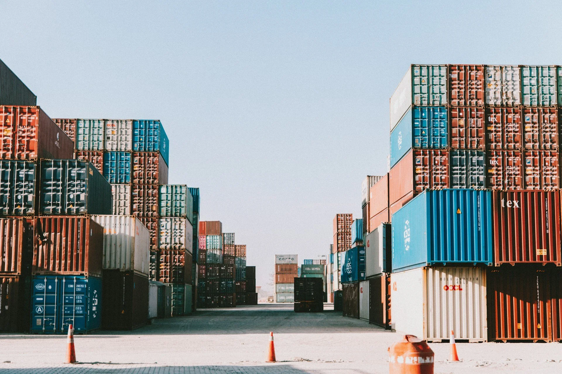
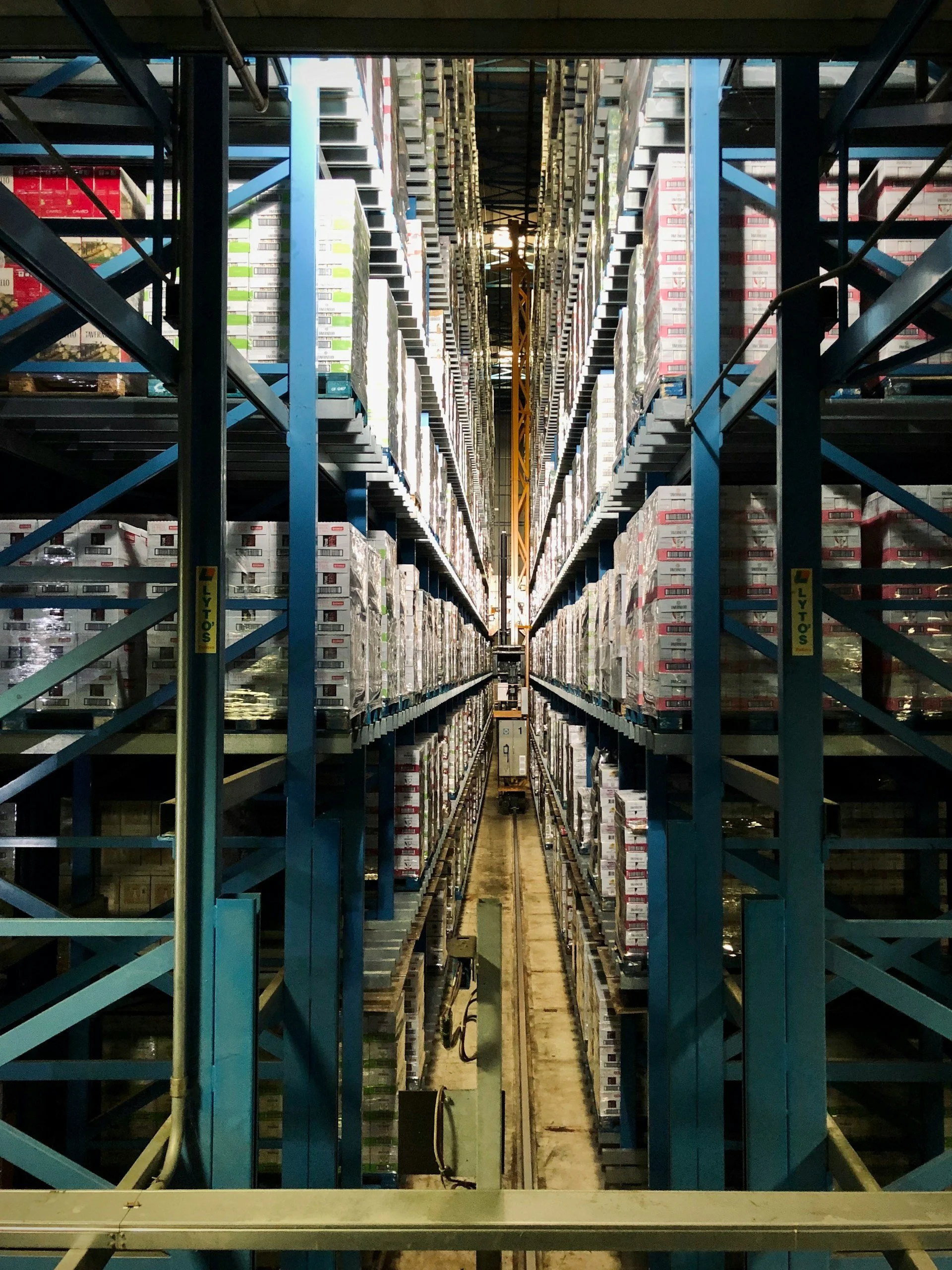
Hypefill is a fast-growing e-commerce fulfillment and logistics company built around a simple but ambitious idea: making storage, delivery and business growth easier, faster and smarter for online sellers. With a expanding client base and an increasingly competitive market position, Hypefill is in an active growth phase, with major milestones including their presence at Netcomm 2026 in Milan, one of Italy's most important digital commerce events.
🧰 My role: Senior Brand Designer building the brand concept, design systems and visual identity from scratch.
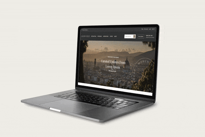
I was brought in to build their brand from the ground up, creating a visual identity and design system capable of carrying the company through this growth moment and beyond. Note: the current website reflects the previous brand iteration. A full website redesign is currently in progress.
The Challenge
The product, the technology and the ambition, but a brand that wasn't keeping pace. The existing visual identity was functional at best, generic at worst. It didn't communicate the energy, intelligence or forward-thinking positioning the company needed to compete seriously in the fulfillment market. The brief was essentially: build a brand that looks like the company they were becoming: a startup moving at scale-up speed.
What I delivered
A complete brand identity and scalable design system, built to work across digital, print, social, merchandise and event environments simultaneously:
Brand strategy and tone of voice · Logo design and full identity system · Colour palette and accessibility guidelines · Typography system · Print collateral · Merchandising · Event stand design · Social media assets and templates · Website redesign in progress
Toolkit for this project:


Brand strategy & tone of voice
Before touching a single visual, the brand needed a clear personality. Hypefill's tone was defined around four pillars: Smart, Upbeat, Enthusiastic, Passionate — translating into communication that is confident and energetic without being corporate. The brand speaks to entrepreneurs and growing businesses, so it needed to feel like a partner, not a platform.
Smart • Upbeat • Enthusiastic • Passionate
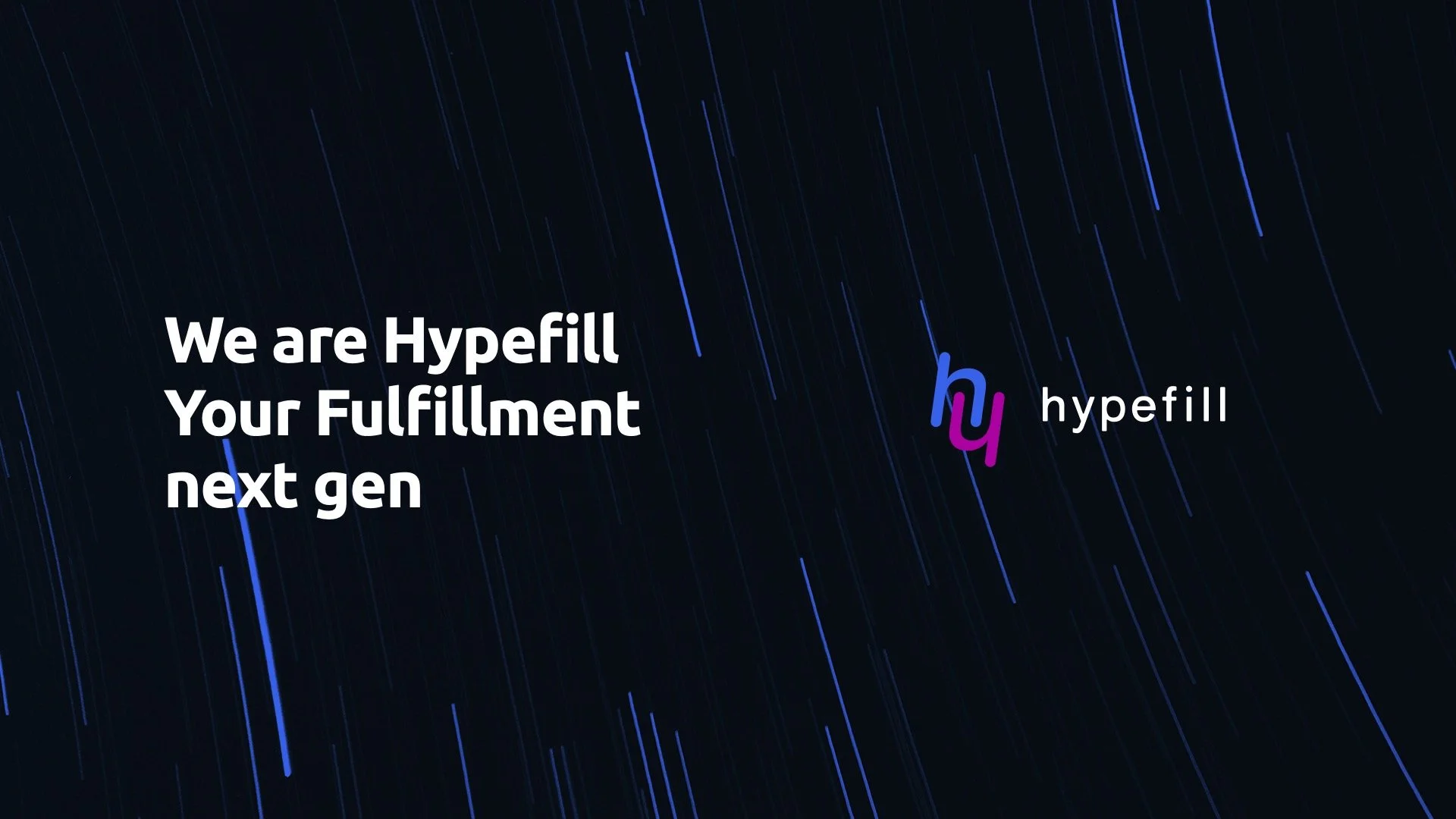
Logo & identity system
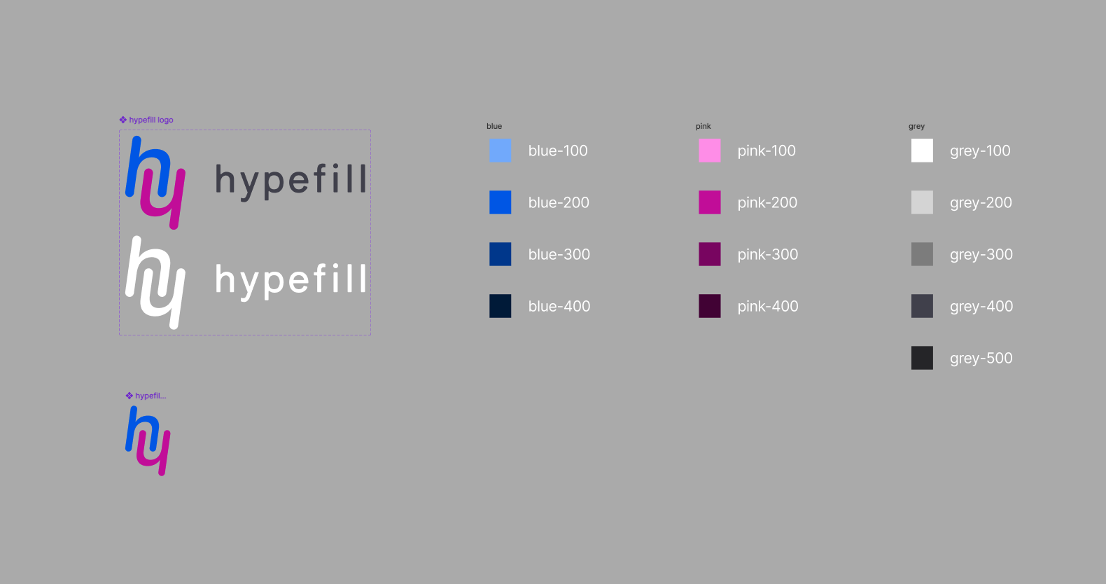
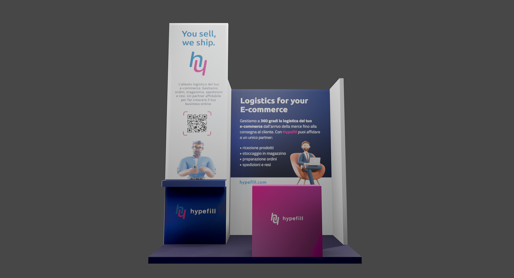
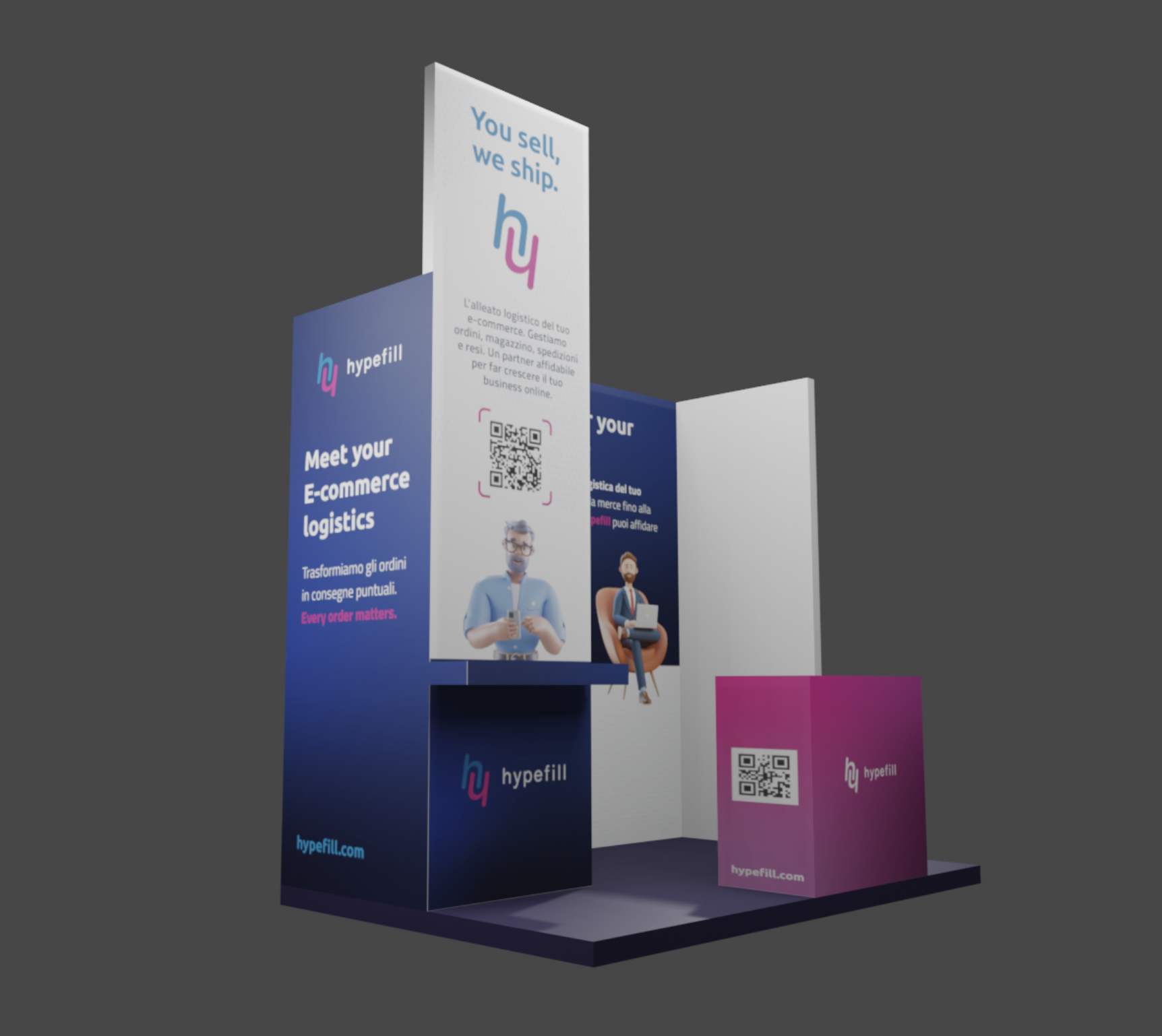
The logo centres on a custom "hy" ligature — two letterforms connected into a single fluid mark that directly references the fulfillment workflow: the connection between a company and its customers, the movement of goods from one point to another. The ligature functions both as a wordmark component and as a standalone icon, giving the brand flexibility across all applications from social avatars to event signage.
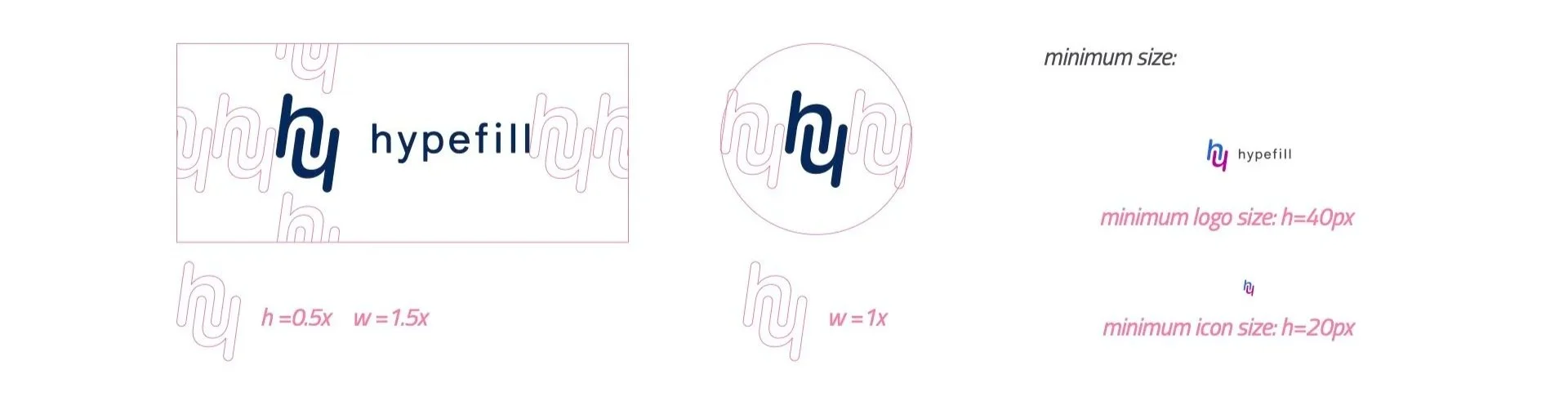
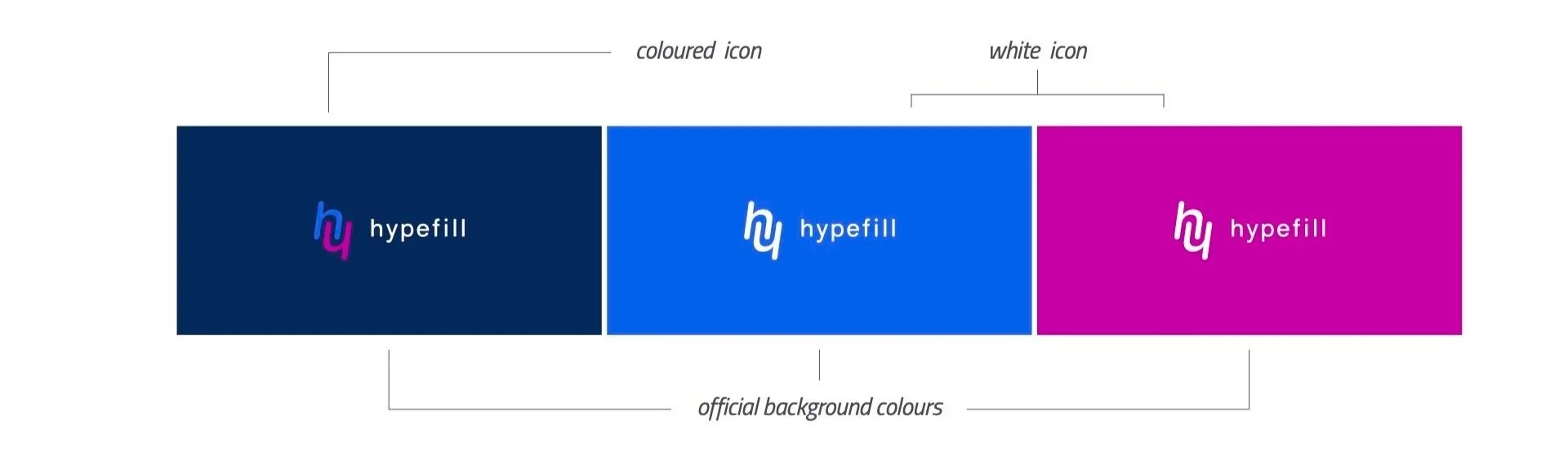
Logo variations cover primary lockup, single colour, reversed, and icon-only. A defined clear space zone (equal to the height of the wordmark) protects the logo from competing visual elements across all applications. Minimum size rules ensure legibility at every scale: 40px minimum for digital, with the icon never smaller than 20px. Typography-only usage is not permitted.
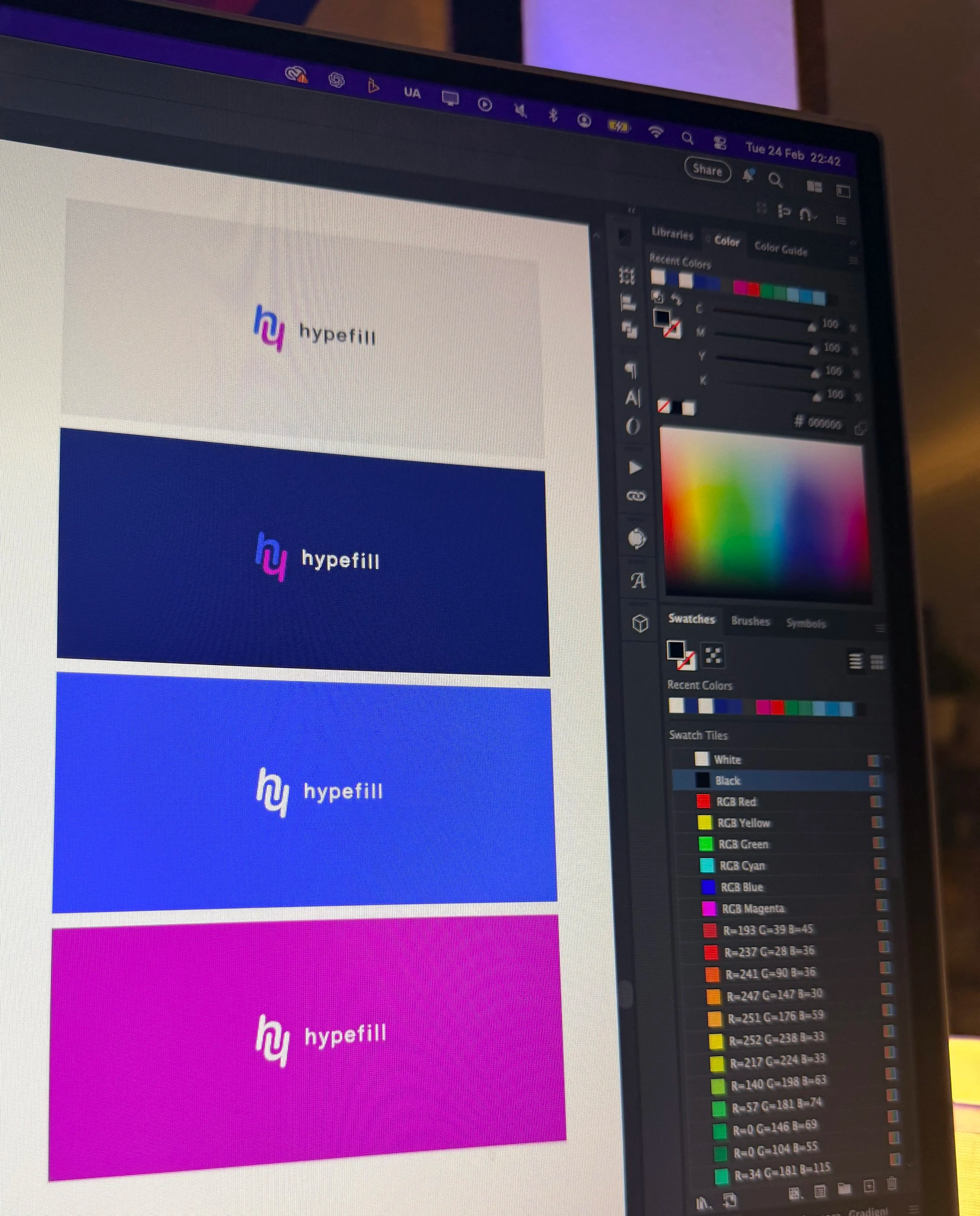
Colour system
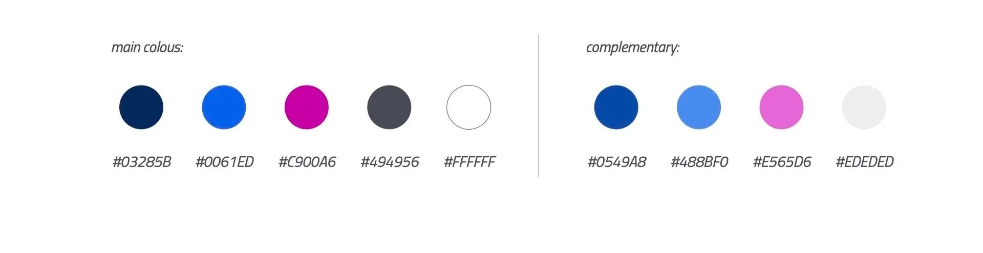
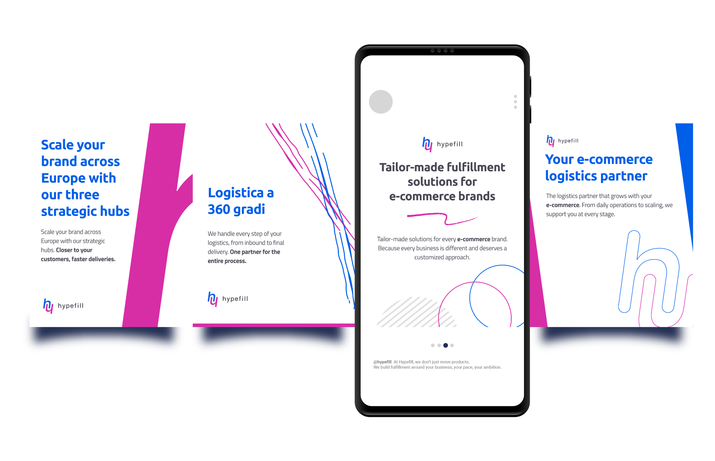
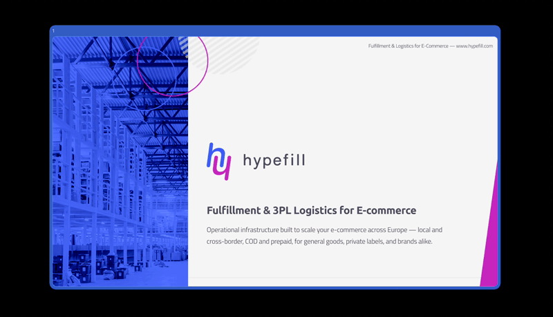
The palette was built around contrast and energy. Navy foundation anchored by electric blue and a bold magenta. Complementary neutrals provide breathing room for body copy and UI applications.
Colour hierarchy defines three tiers of application: primary for logo and dominant surfaces, secondary for supporting elements, tertiary for accents. Accessibility combinations were tested and documented, with fail states clearly marked to prevent incorrect usage in production.
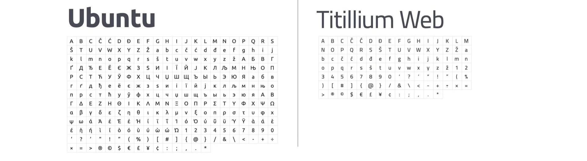
Typography
The two typefaces: Ubuntu that carries the headlines (bold, geometric, unmistakably modern) set in bold with tight tracking and title case. Titillium Web handles body copy (clean, readable and engineered for digital environments) set in light with open tracking and normal case.
Together they create a hierarchy that works at every scale, from a large-format event banner to a mobile notification. Italic is accepted in body copy for emphasis. Neither font should be substituted or mixed with external typefaces outside of the defined system.
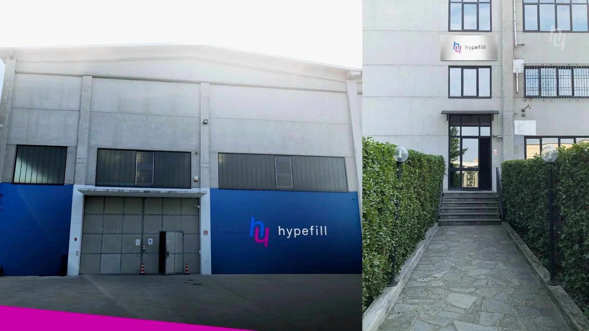
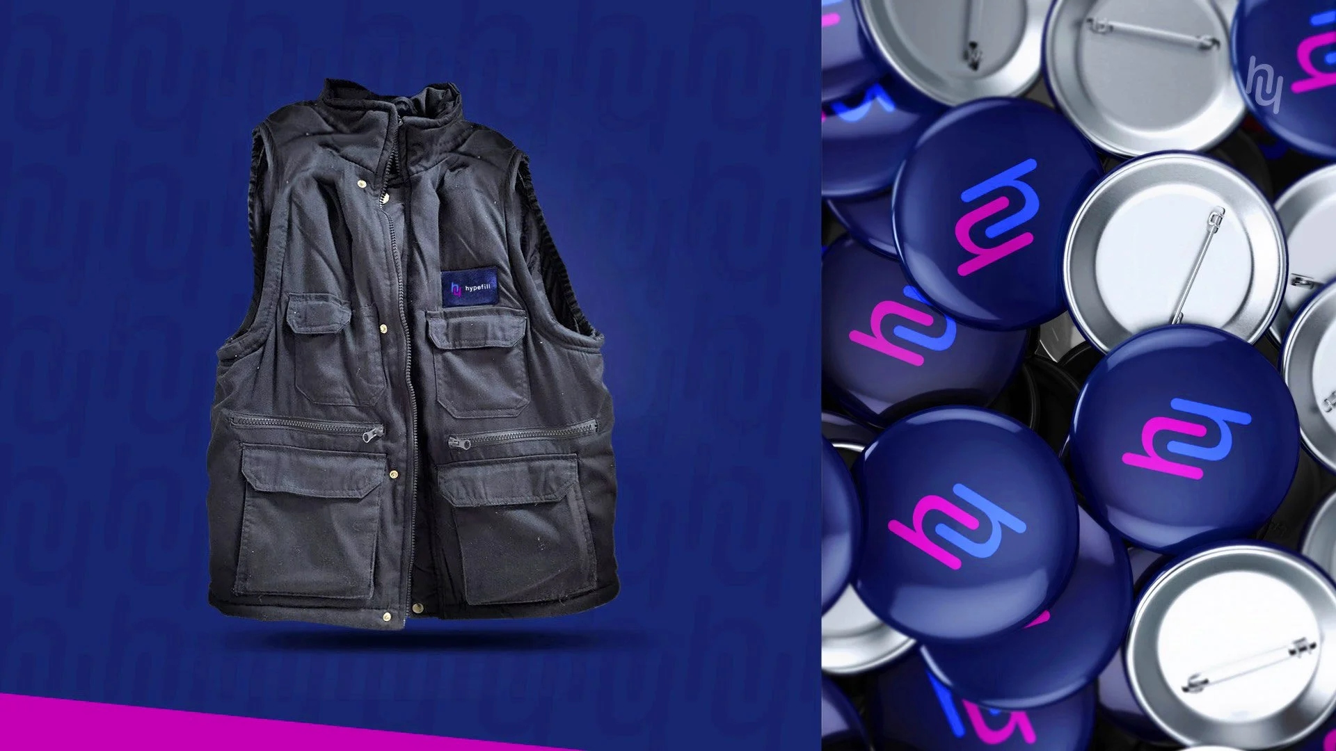
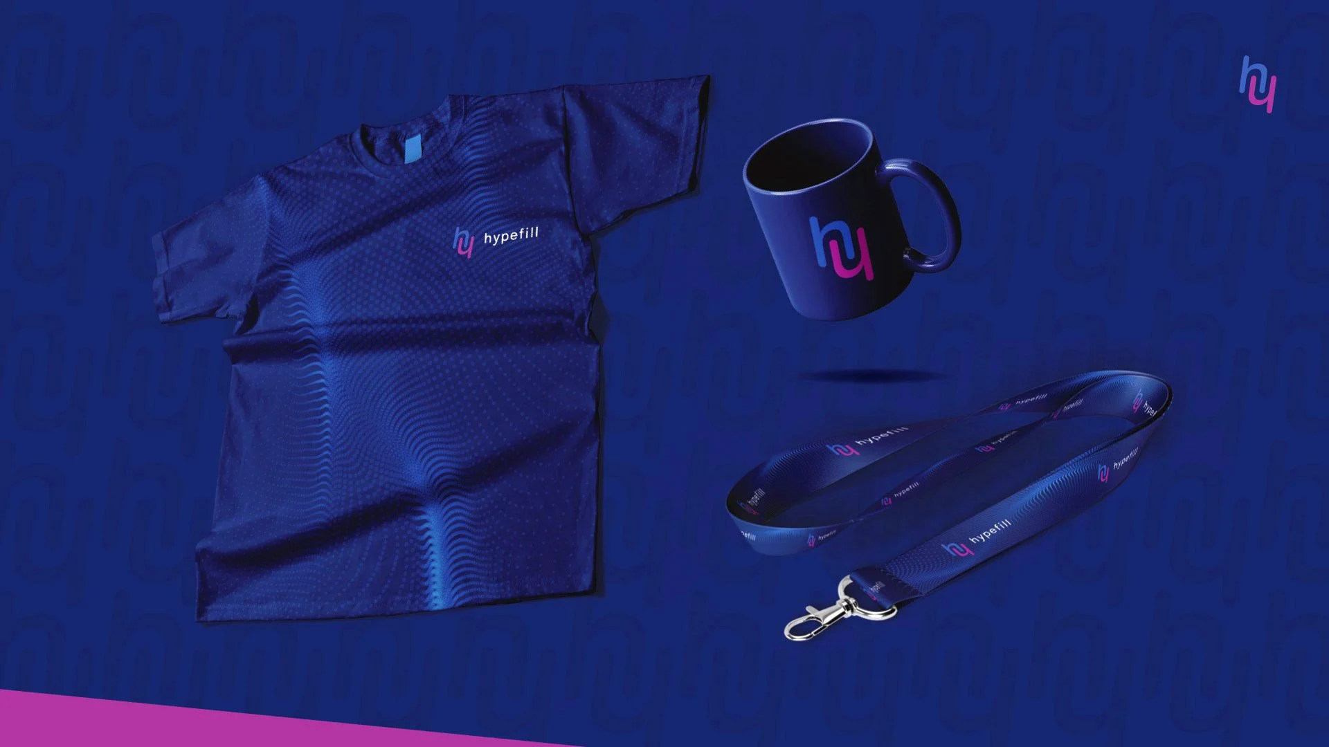
Visuals & Brand applications
The system was built to perform across real-world touchpoints. Brand applications include print collateral, merchandise, event stand designs (most recently is Netcomm 2026 in Milan), and an ongoing social media asset suite across digital channels.
Outcome
A brand built for growth. Identity system, design guidelines, print, merch and event presence all delivered ahead of Netcomm 2026. Hypefill now has a visual language that matches where the company is going, not where it started. The rollout is live and ongoing, with website redesign in progress and social content in active production.
MORE CASES
Additional brand & campaign work across digital platforms